For a long time, I didn’t consider my digital spaces part of my lifestyle at all. I treated them as purely functional, something I used rather than something I inhabited, even though I spent hours each day moving between screens.
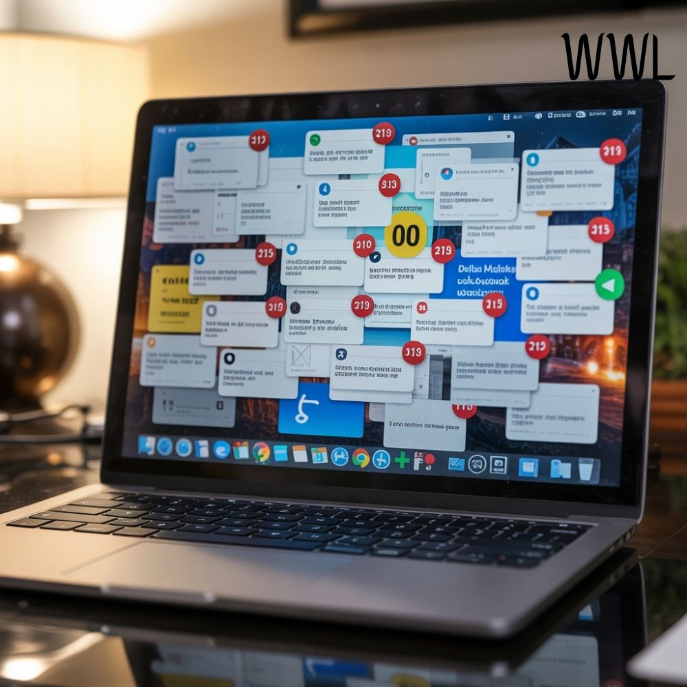
The moment I opened my laptop or unlocked my phone, that sense of clarity quietly dissolved. Notifications competed for attention, visual noise filled every background, and my screens felt busy in a way my physical environment never did.
The disconnect became impossible to ignore one evening while I was working late. Everything around me felt composed, except the glowing rectangle in front of me.
My desktop was cluttered with icons I no longer noticed, my screensaver rotated through images that meant nothing to me, and I realized that the very tool meant to support my focus was quietly eroding it.
Calm is not limited to physical spaces. If intention truly shapes how we live, then our digital environments deserve the same level of care as our homes.
The change that followed was surprisingly small, but its impact has been anything but. I now follow one simple screensaver rule that keeps my technology feeling calm, refined, and supportive rather than cluttered, and it has transformed how I experience my days.
Visual Noise on Screens Affects Us More Than We Admit
We tend to underestimate how deeply our screens influence our mental state because their presence has become so normalized. We curate our homes carefully, adjusting lighting, color palettes, and textures to create calm, yet we accept chaotic digital visuals without question.
Bright colors, dense imagery, and constantly shifting backgrounds subtly demand attention, even when we’re not consciously engaging with them.
I noticed that after long work-hardened days, I felt mentally tired in a way that didn’t match the effort I had exerted. My eyes never truly rested, and my mind never fully settled, because my screens were always asking for engagement, even in moments meant for pause.
Just as visual clutter in a room creates tension you may not consciously name, visual clutter on a screen creates cognitive friction. Once I recognized that parallel, I realized that digital calm was not a luxury or aesthetic preference, but a practical necessity for clarity and focus.
The Screensaver Rule I Live By
My rule is simple, but uncompromising: my screensaver must never ask anything of me. It should not inspire, motivate, entertain, or provoke emotion. Its sole purpose is to create visual rest.
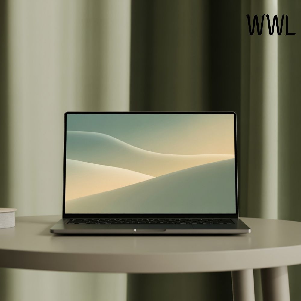
This means no rotating photo galleries, no bright colors, no text, and no images tied to memories that pull my mind elsewhere. I choose screensavers that are neutral, static, and intentionally understated, often a soft gradient, a muted tone, or a subtle texture that feels almost architectural in its simplicity.
The screensaver becomes a pause rather than a prompt. It exists to support stillness, not stimulation.
Why I Avoid “Inspirational” Screensavers Entirely
At one point, I experimented with quotes, affirmations, and beautifully designed messages meant to inspire productivity or positivity. Each time my screen dimmed, my mind reacted. I read the words, evaluated them, and briefly shifted away from the task or moment I was in.
Inspiration has its place, but constant inspiration is another form of noise. I realized that I didn’t need encouragement every time my laptop rested. I needed quiet. I needed space where my thoughts could settle without direction.
Removing inspirational screensavers was one of the most freeing digital decisions I’ve made. It reinforced something I now hold firmly: confidence grows in silence far more reliably than it grows in motivation.
How This One Rule Changed My Relationship With Technology
Once my screensaver stopped demanding attention, my entire relationship with technology softened. I felt less urgency to constantly check my phone, less resistance when returning to work, and less mental fatigue at the end of the day. My devices began to feel like tools again, not environments that competed with my physical space.
The calm carried into my routines. Waiting moments felt less restless. Transitions between tasks became smoother. Even my posture changed, as if my body no longer braced itself against invisible stimulation.
It surprised me how much influence such a small visual element had, but it confirmed something I deeply believe: intention works quietly, but consistently.
How I Choose Screensavers That Feel Aligned
When selecting a screensaver now, I ask myself a few specific questions, the same way I would when choosing an object for my home:
Does this feel visually quiet rather than interesting?
Does it support rest rather than engagement?
Would I want to sit beside this for hours without feeling distracted?
Most often, I choose neutral colors that already exist in my home, such as soft beige, warm gray, or muted stone tones. Occasionally, I opt for subtle gradients that shift so slowly they’re almost imperceptible. The goal is not beauty in the traditional sense, but harmony.
Final Thoughts
The screensaver rule I follow is not about minimalism for its own sake. It is about respect, for my focus, my time, and my mental clarity. In a world that constantly asks for attention, choosing visual quiet is a subtle act of confidence.
Technology does not need to dominate our senses to be useful. When approached with intention, it can become as supportive and refined as any well-designed space.
And sometimes, the most powerful shifts come not from adding more, but from removing just enough to let calm return.